
Google has been telling us to be more mobile friendly for a few months now, but now they have upped the ante considerably by announcing a mobile focused algorithm update.
This update will happen on April 21st and will affect millions of mobile searches across the world; it’s the biggest shakeup of their algorithm for a long time and you need to be ready.
The background
Google already places a great deal of importance in the mobile usability of a website with regards to where it ranks compared to other sites. As well as the announcements, they have expressed this via the introduction of a mobile usability auditing section in Google Webmaster Tools and also added tags to sites in the SERPs that meet their criteria.
They’ve also made it possible to search for other mobile friendly content by introducing app indexing.
Google’s official announcement is worded as thus:
“Starting April 21, we will be expanding our use of mobile-friendliness as a ranking signal. This change will affect mobile searches in all languages worldwide and will have a significant impact in our search results”.
But my site is responsive, surely that means it’s mobile friendly?
Well, not really; your site might be mobile responsive but there are quite a few other factors you need to look at, including how Google is allowed to access certain files, button sizes, speed and much more.
As Google says here, the most common mobile SEO mistakes they see are blocked JavaScript, CSS and image files, mobile only 404s, slow mobile pages and irrelevant cross linking.
Even if your pages are showing as “mobile friendly” in the SERPS, you really can’t be too careful on this one.
Our article takes you through how to check for anything that might come back to haunt you when Mobilegeddon hits.
Check how Google’s mobile “bot” indexes your pages
There are a couple of ways in which you can do this.
Google Webmaster Tools
This is the Holy Grail to most technical SEO enthusiasts as it shows you how Google sees your site. You can see how it varies in indexation, page download times and even the keywords bringing people to your site; as well as this, it shows you the links you have and how many pages in each domain link to you.
For the purposes of this audit however, we are just looking at indexation.
In the left hand menu, go to “Crawl” and then “Fetch as Google”.
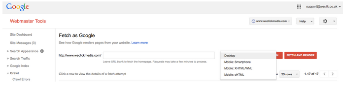
You can change the options in the dropdown so that you can see how Googlebot for Smartphone indexes your site. If you want to see how Google indexes your pages on a feature phone, then select XHTML/WML.
Click “Fetch and Render” to see how Googlebot for smartphone fetches and renders your individual pages; if there are any problems then they will be revealed below.
A “Complete” with a green tick next to the URL means that it has been fetched and rendered successfully. A “Partial” or “Blocked” means that you need to click through and find out what has stopped Googlebot from processing the URL successfully.
As well as this, under “Search Traffic” on the main navigation bar, you will find the “Mobile Usability” function. Clicking on this will also reveal what is stopping your website from being mobile friendly.
Screaming Frog
Screaming Frog is a great tool that allows you to audit all of the files on your website; giving you a “bird’s eye view” of metadata, file size, tags, response codes and more.
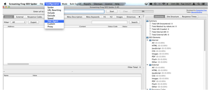
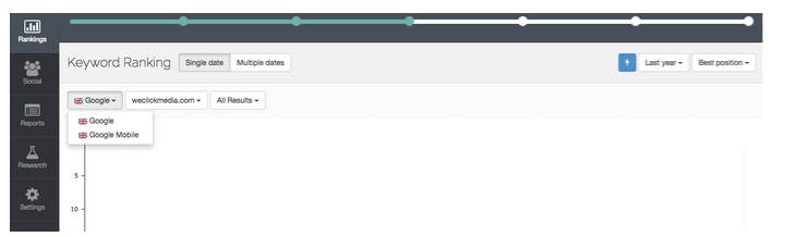
As you will see from the screenshot above, you can edit the user agent you use to index the pages on your site. Just go to “Configuration” and “User Agent” and select “Google Mobile”. All pages indexed by Google mobile will then appear in the box underneath.
One thing you can do to make sure that all pages are indexed properly in Google Mobile is cross-reference the findings above with a list of the pages on your site you know you have.
If your mobile and desktop sites offer the same content, you can use a tool called SEOQuake to export the results of your site:http://www.domain.com search and cross reference with what you’ve got from Screaming Frog.
All you have to do is:
- Export the SERP data from a site: search
- Export the data generated from Screaming Frog when you have Google Mobile as a user agent
- Keep these two in separate tabs and run a VLOOKUP on the SERP dataset to mark if it finds the URL in the Screaming Frog Dataset; any URL that is next to the SERP URL with an “N/A” next to it is not indexed by Google Mobile and should be investigated. Run it manually through the “Fetch and Render” tool in Google Webmaster Tools if you have access.
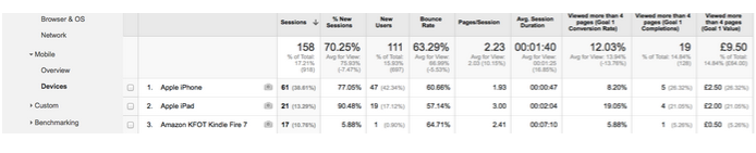
Look at cross device engagement on your site
One way in which you can see whether or not there is a big difference in how mobile and desktop users engage with your content is to segment your Analytics data into desktop, mobile and tablet view.
This is a good way to get topline figures on the differences; obviously if you pride yourself on having a mobile responsive site and engagement on mobile is vastly worse than that of desktop then you need to investigate further.
Why not have a look at which mobile and tablet devices are bringing traffic to the website and try and spot any discrepancies there?
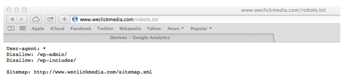
Check that Googlebot can access all of your files
If you have a robots.txt file (and you should!) and you have blocked Google from seeing your image, CSS or JavaScript files then you run the risk of falling foul to mobilegeddon.
If you see “/images” or “/CSS” next to the “Disallow:” in your file then remove them. Also look for signs that JavaScript is disallowed.
Why? This is because Google needs to look at these things in order to determine how they will work on a mobile device.
Confused about how to add things to a robots.txt file? Here is ours for your reference:
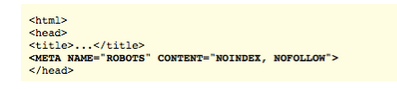
Also check the source code on your pages to ensure that you have not accidentally blocked or made anything NoFollow by adding meta robots tags. These directives can be added at page level and look something like this:
Screaming Frog will also tell you if pages are blocked in this way.
Compare mobile rankings to desktop rankings
Getting the data
We use AWR to keep track of where we rank in mobile and desktop and this is what we suggest you do when looking at yours.
Because we have added Google Mobile as a search engine, we can switch to this view easily and generate a report that way.
If you do not have Google Mobile added to this, then where have you been?
Jokes aside, do this by clicking on “Settings” and going to the settings for the account you are in.
You will then see “Search Engines” among the options. Click on that and you will see a green button that says “Add Search Engines”. If you do not see Google Mobile added here then click on this button to add it in.
Simply run two reports, one for desktop and the other for mobile. When you have generated them, cross-reference the figures and make note of any discrepancies. I tend to find that using the VLOOKUP formula to pull in all of the figures on one tab makes this process a lot easier.
Using the SUM formula to calculate the difference and then using conditional formatting to highlight any notable discrepancies will help you spot these easier.
Using the data to make key changes
Once you have all desktop and mobile rankings for each page of your site, you should then group them into the pages each keyword ranks for so that you can note any pages of your website that are particularly affected by the difference.
It might be worth having a deeper look into these pages on an individual basis and seeing what might be causing the difference in rankings.
Cross reference with your Analytics data, keeping desktop and mobile in your segmented view and have a look for things like reduced traffic and engagement in mobile.
Avoid duplicate content and sitemap issues for mobile specific websites
Note that this does not apply to responsive websites, only to websites that have a separate mobile site.
If your pages are the same on your m.domain.com website as they are on your separate domain.com website then you will need to tell Google, otherwise they will potentially penalise you for duplicate content.
On the desktop pages, add a rel=”alternate” tag pointing to the corresponding mobile page.
On the mobile pages, add a canonical tag pointing to the corresponding desktop page.
Google also supports adding a rel=”alternate” tag to your XML sitemap so that they can see that there is a mobile version of each desktop page. This will help them be indexed properly.
Google is very clear on the fact that you should always stick to a 1:1 ratio when adding alternate and canonical tags, never point these to a page that is not identical and never ever point multiple desktop pages to a multiple mobile page.
Run your website through this checklist
OK, this is point number six but it was too important to leave out.
Run your site through this checklist and make sure you’re not making any of Google’s common mobile SEO mistakes.
These include having unplayable Flash content or content that is not suited to mobile devices, mobile only 404’s and slow mobile pages.
The checklist is here.
So, those are our tips for avoiding mobilegeddon and keeping your mobile rankings!
By Becki Woods, WeClick Media.
PrivSec Conferences will bring together leading speakers and experts from privacy and security to deliver compelling content via solo presentations, panel discussions, debates, roundtables and workshops.
For more information on upcoming events, visit the website.
comments powered by Disqus